Provider accounts
Provide users with better visibility, management and understanding of their Logistic Service Provider (LSP) account data.

The Team
- Senior experience architect
- Product owner
- UI designer
- Backend developers
- Frontend developer
- Data engineer
The Problem
Gathering and maintaining Provider account data is a time-consuming process for both our customers and internal users in the Customer Success (CS) team. Most of the data is held in different Google documents and sheets or in the platform database. Without a comprehensive, unified overview of the data, users lack the ability to access account data, manage accounts efficiently or understand provider accounts' performance.
Goals
Our goal was to create an experience that would provide customers and internal users with better visibility and a greater understanding of customers' logistics data at an account level.
Our secondary objective was to launch the first version in a timely and efficient manner, so we could then analyse usage and iterate and improve on the original solution quickly to deliver incremental value to our customers and also internal users of the platform.
Role & Responsibilities
As the UI designer on this project, I worked closely with the senior experience architect to ensure the end-product user experience was intuitive and easy to use. Our key design challenge was to ensure that the high density of data was presented visually in a mode that aids understanding and allows users to reason about the content.
I was integral in the creation and development of the product's visual style, as well as defining and prototyping the interactions. I worked closely with the development team to ensure adherence to design standards and guidelines, and assist with smooth implementation. In parallel with this, I reworked the document card in the design system, creating a reusable and robust component that could be used in this UI and across other UIs in across the platform.
In my role as UI designer on the project I performed the following tasks:
- Feedback, evaluation and refinement of the user journey
- Creation of high fidelity designs with a focus on the way data is visualised and presented to the user
- Building a prototype
- Component standardisation and creation for design system
- QA
Research
Given time-constraints, the first version was developed by conducting research with internal users in the Customer Success team.
Solution
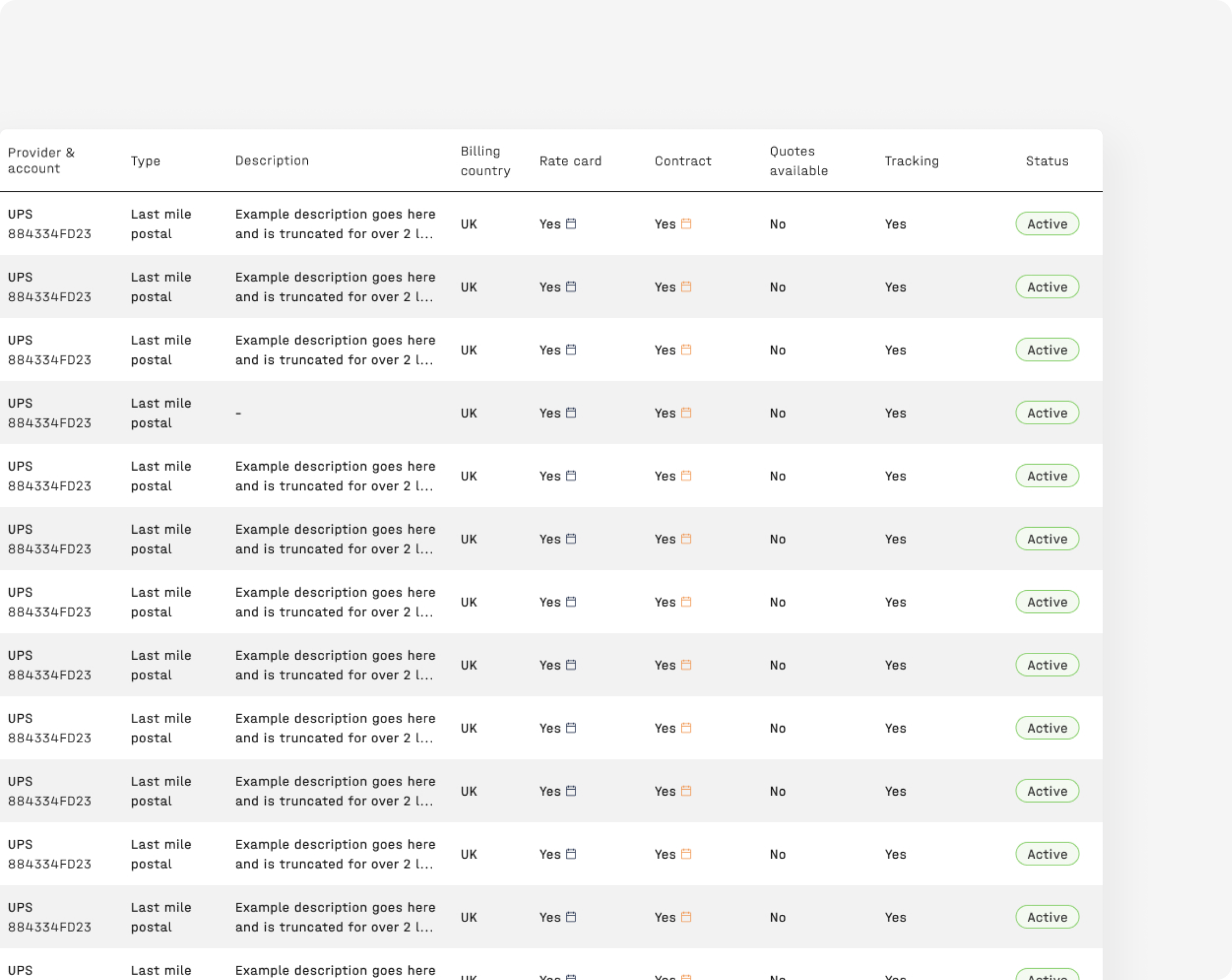
Interface with a list of accounts linking through to detailed information for each account.
Challenges
One of the biggest challenges we face as a design team is designing for large amounts of data. Our users process, decipher and often need to act on a variety of different datasets. So one of our main challenges is how to handle and present these varying sets of data in an interface in a way that aids understanding, adds value and prompts action where necessary.
When you show people data, your job is not to dumb things down, it's to make everyone who looks at it smarter.Edward Tufte
We drew on some of Edward Tufte's best practices for presenting information by utilising high density displays, to ensure users can see, explore and act on the data. Below I have highlighted some of the components and data visualisations chosen to aid understanding of the data and allow for a data-rich interface.
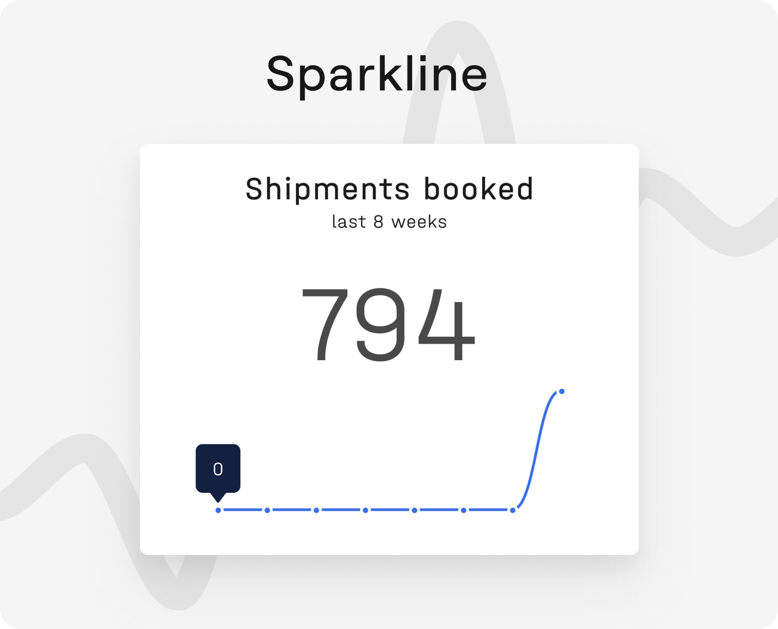
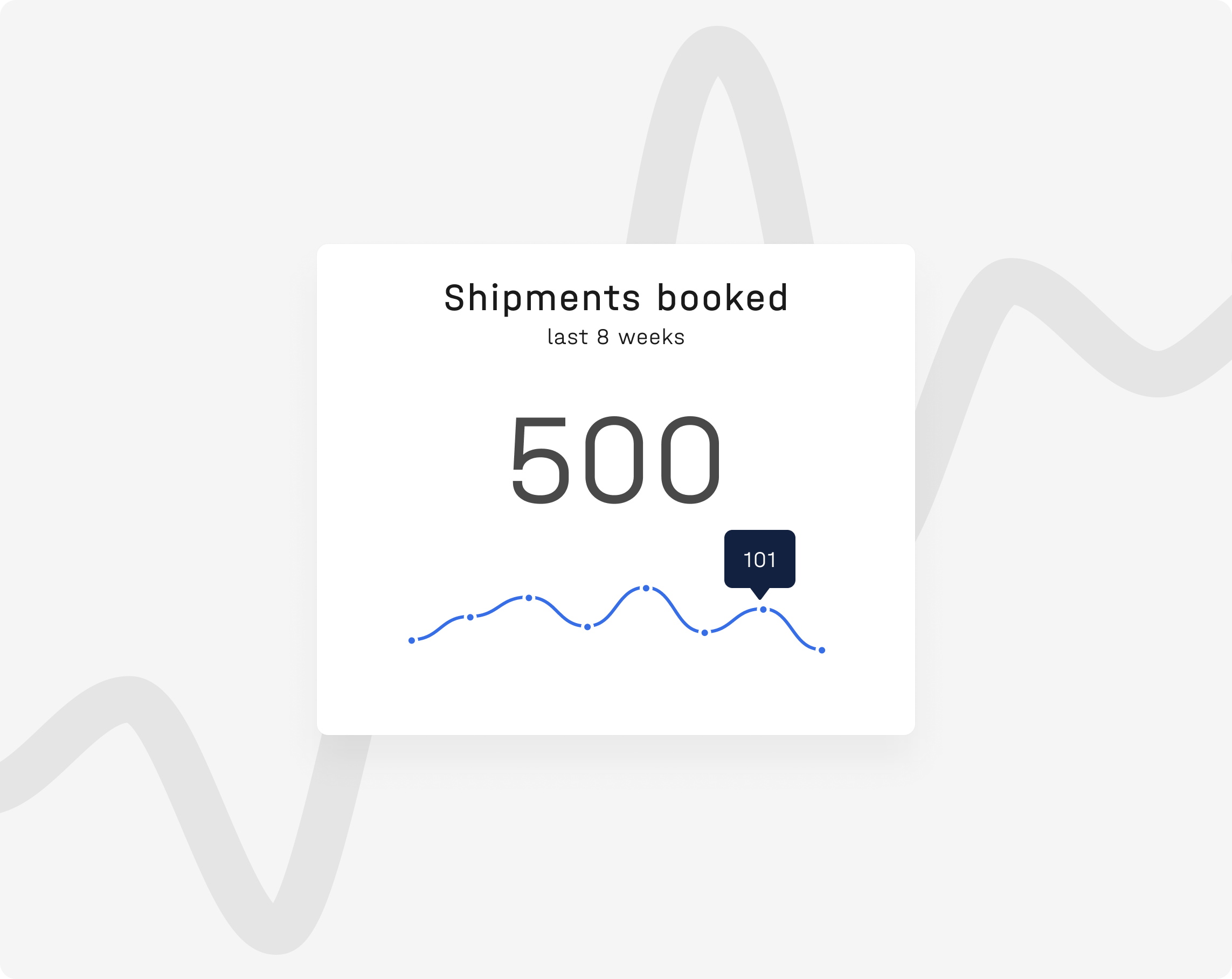
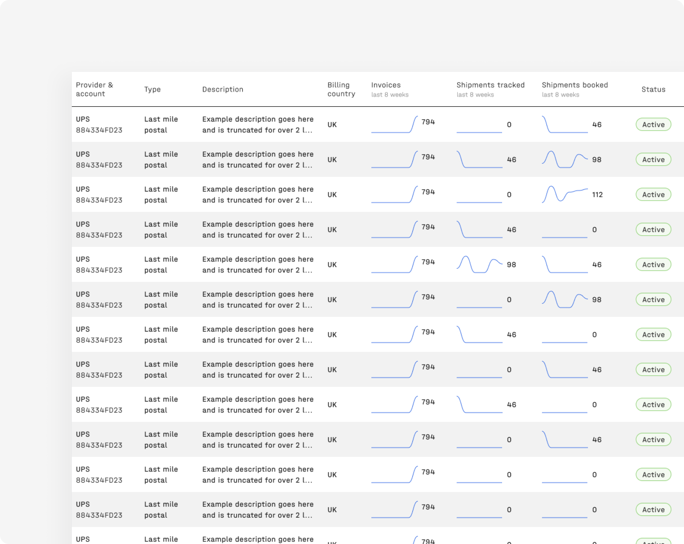
Sparklines can be embedded in any context suitable for words and numbers. We combined them with a total figure and used them to showcase 8 weeks of activity history in table cells and an activity report card. Sparklines are good for tracking and showcasing trends over a period of time. They are also good for showcasing any outliers and reducing any recency bias, which can be an issue for tabular data. In short, these small, simple, high resolution graphics are both versatile and ideal for our use case.
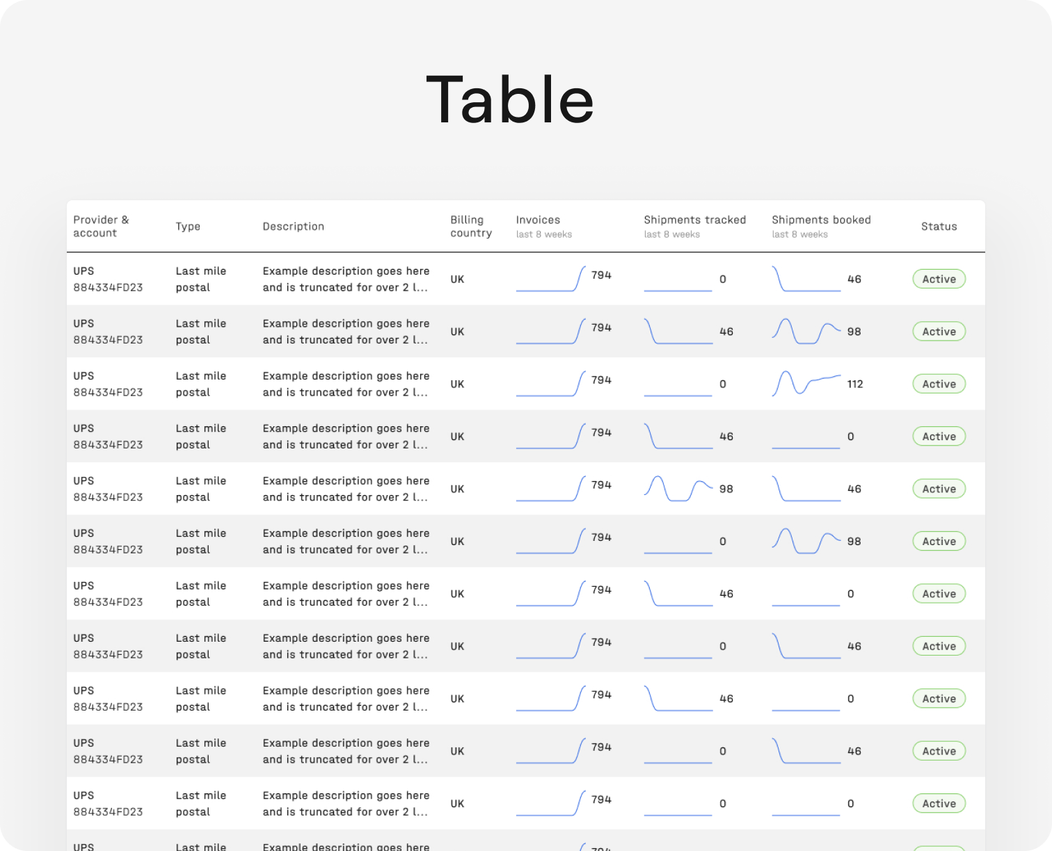
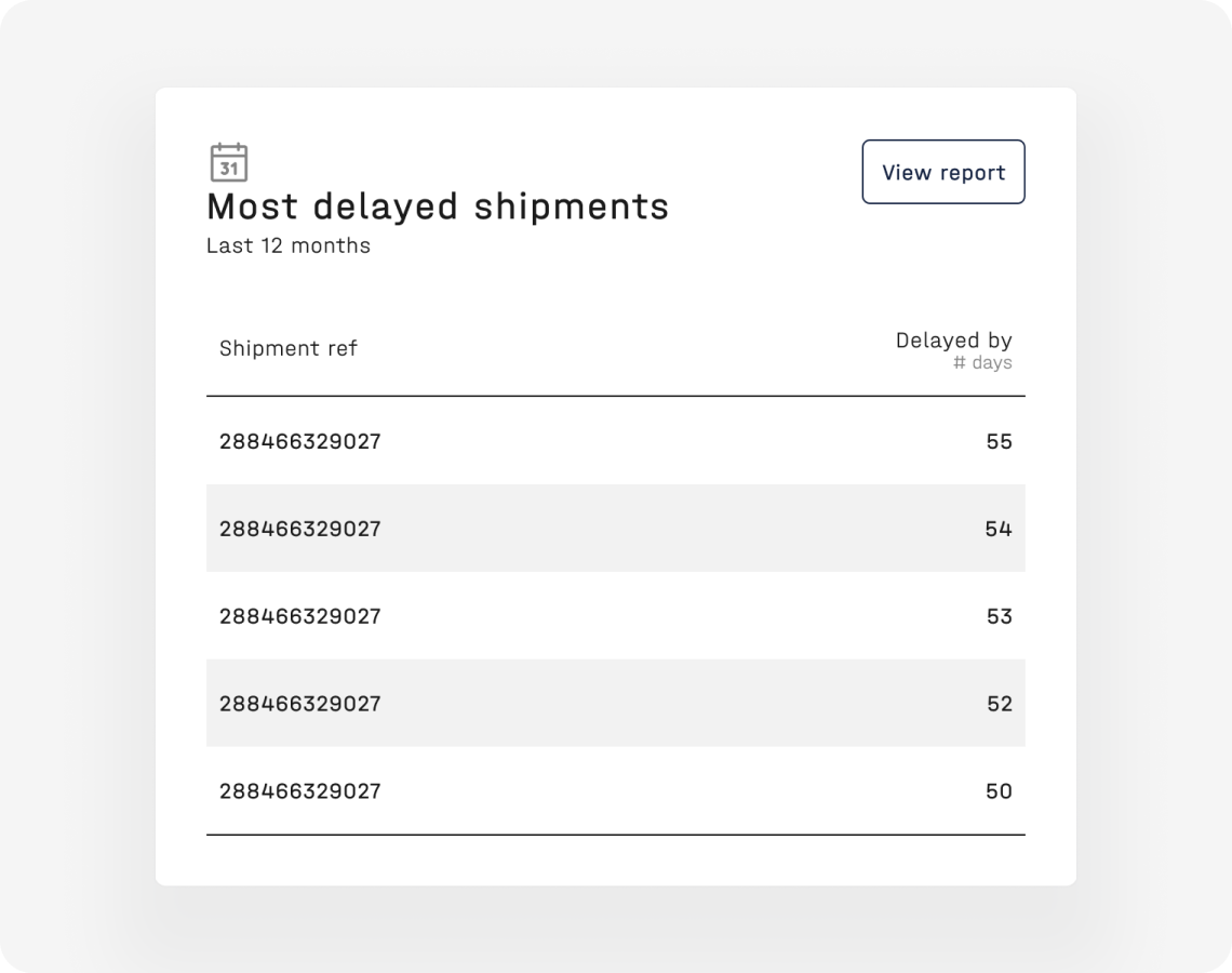
Tables containing rows of linked accounts allows for easy comparison of key data relating to accounts. Users can also use the search input field, filter panel or quick sorting functionality to find data that fits specific criteria.

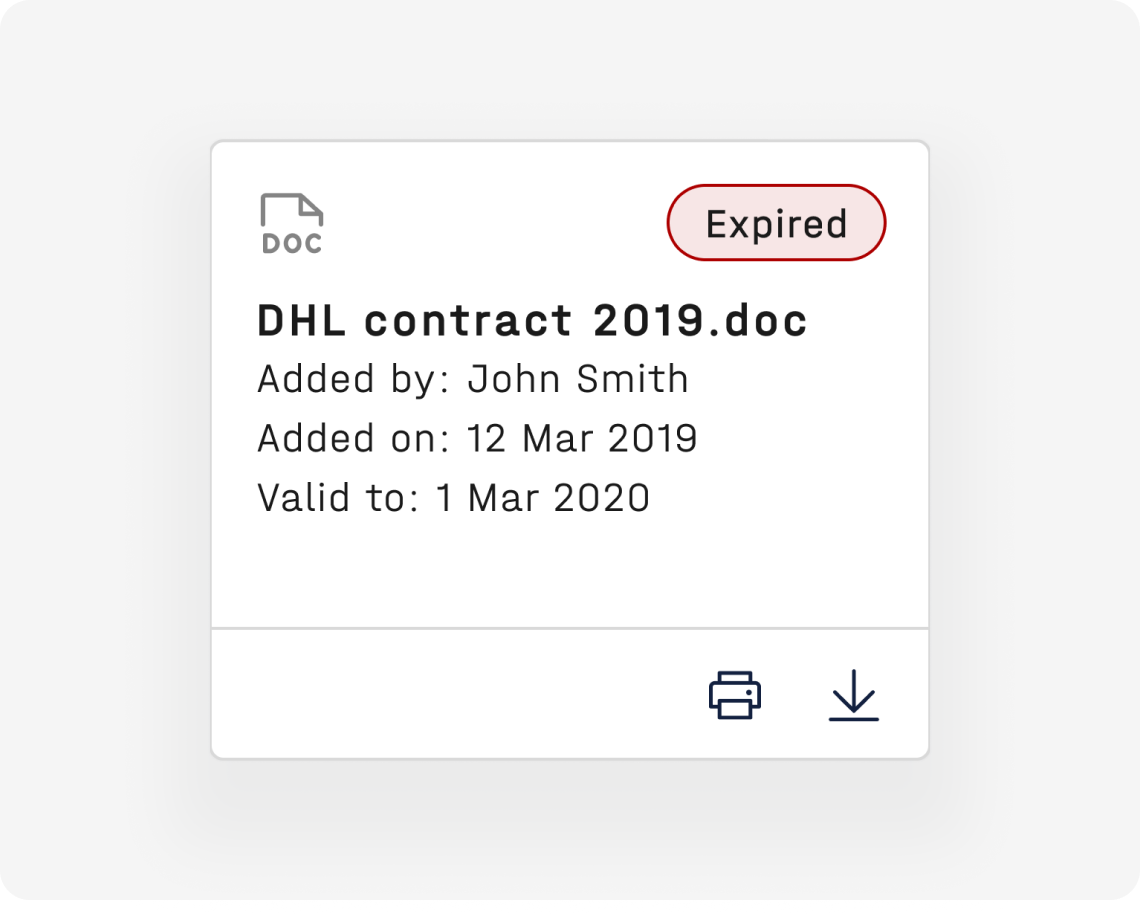
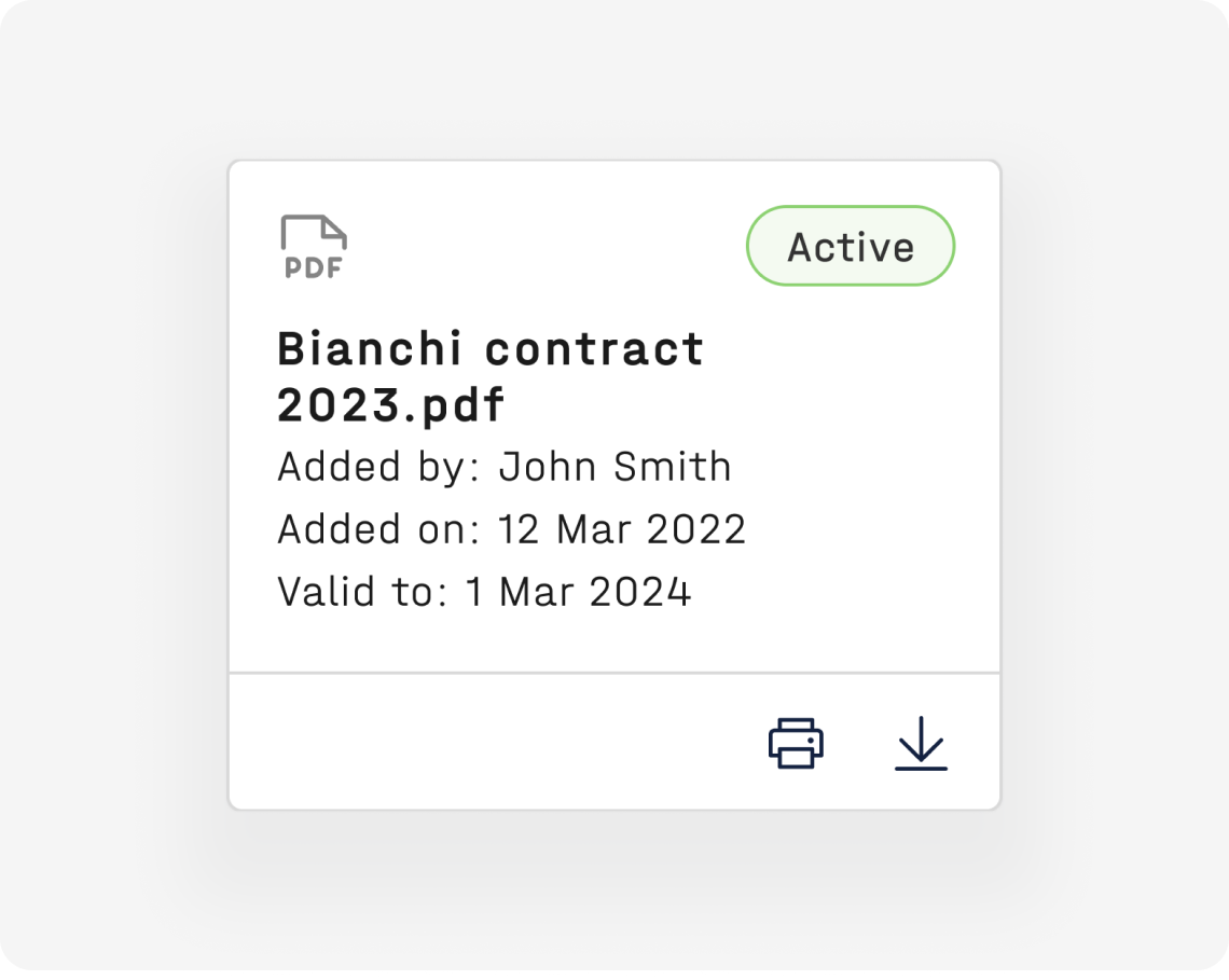
The document card component gives users greater visibility of and control over their documents. It allows users a quick overview of the important information relating to that document. Users can also perform actions e.g. downloading or printing docs. I used this opportunity to review all use cases for the docs card and consolidate them into a single component. Thereby reducing visual inconsistency across the platform and creating a ready-made component available in the library for easy use in existing and future interfaces.
The Impact
- Streamlines access to LSP account data
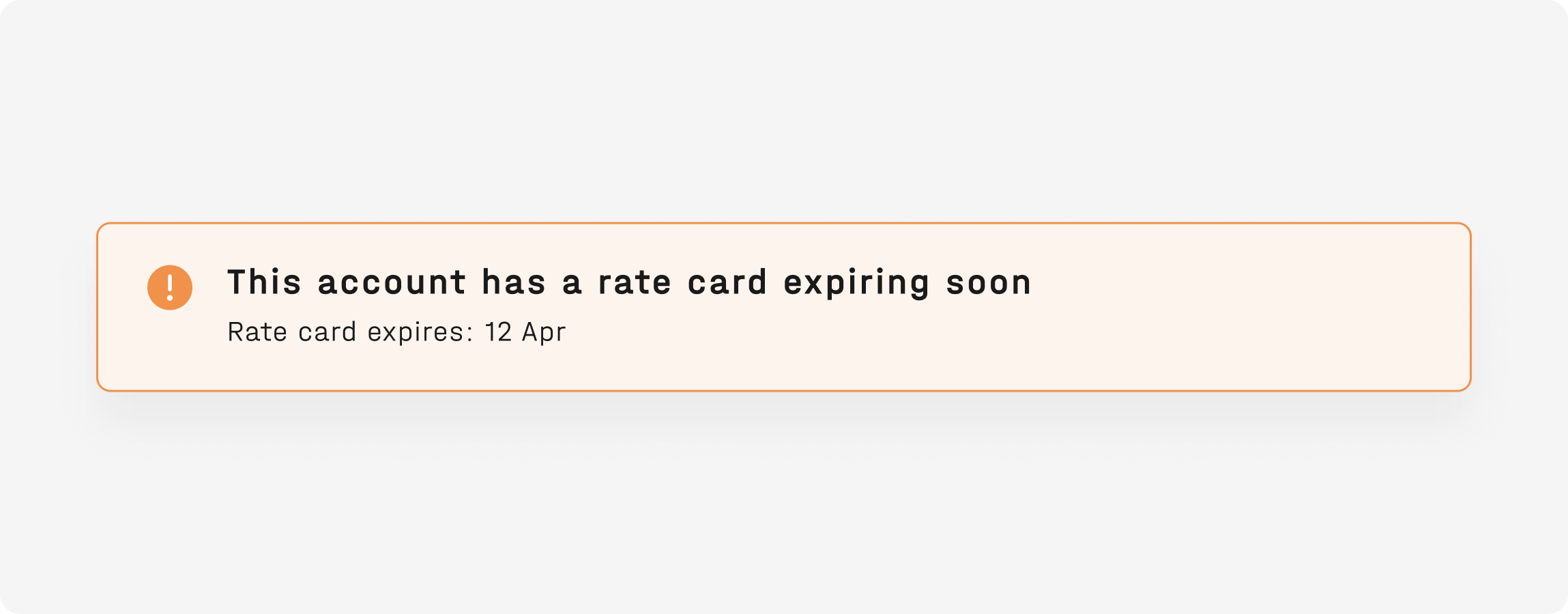
- Allows users to easily identify expired or soon-to-expire contracts so they know when to run procurement exercises to secure the best rates
- Configure accounts across all locations and carriers in one place and quick and easy identification of incomplete account data
- Better insights and understanding of account activities and performance
Next Steps
- Conduct interviews with internal and external users to validate our original assumptions and ensure all the data and tools needed to successfully manage provider accounts is available to them.
- Gather metrics and monitor interface usage for internal and external users using our analytics platform Heap.
- Conduct additional user research to see if there are any user needs that have not been met in version 1. The original assumption was that users require more control over the accounts and would need the ability to add, edit and archive accounts, we need to validate this assumption.