7bridges design system
I have worked on creating a flexible, scalable design system, consisting of reusable components and patterns, allowing for consistency and coherence in visual style and user experience across the 7bridges (7b) platform.


The Team
- UI Designer
- Design team
- Frontend developers
Goals & Benefits
- Reuse of ready-made components and resources - allowing designers to focus their efforts on solving user needs, rather than recreating elements and reinventing solutions.
- Consistency and uniformity in visual appearance and user experience - eliminating unnecessary learning and confusion for users.
- Accelerated time to market - get features in front of users faster, test assumptions earlier and iterate quicker to deliver more value.
- Shared language between designers and developers.
Role & Responsibilities
When I started in my role as UI designer the design system was in its infancy. It had been put together quickly, without considering scalability or flexibility. It contained a basic set of poorly named core values, no documentation and brittle components. The 7b platform used the existing design system in a few places, resulting in a lack of unified user experience and visual consistency. As the sole UI designer in a small team, I took action to make incremental improvements to the system over the course of my time at 7bridges.
In my role as UI designer with accountable ownership of evolving, developing and improving our design system, I perform the following tasks:
- Conduct audits of the existing platform and component usage.
- Conduct research into best practises, industry standards and accessibility considerations.
- Understanding of the requirements, task, target user, context of use and potential future needs of users.
- Creation of new architecture for the design system: design tokens, components and pre-styled components.
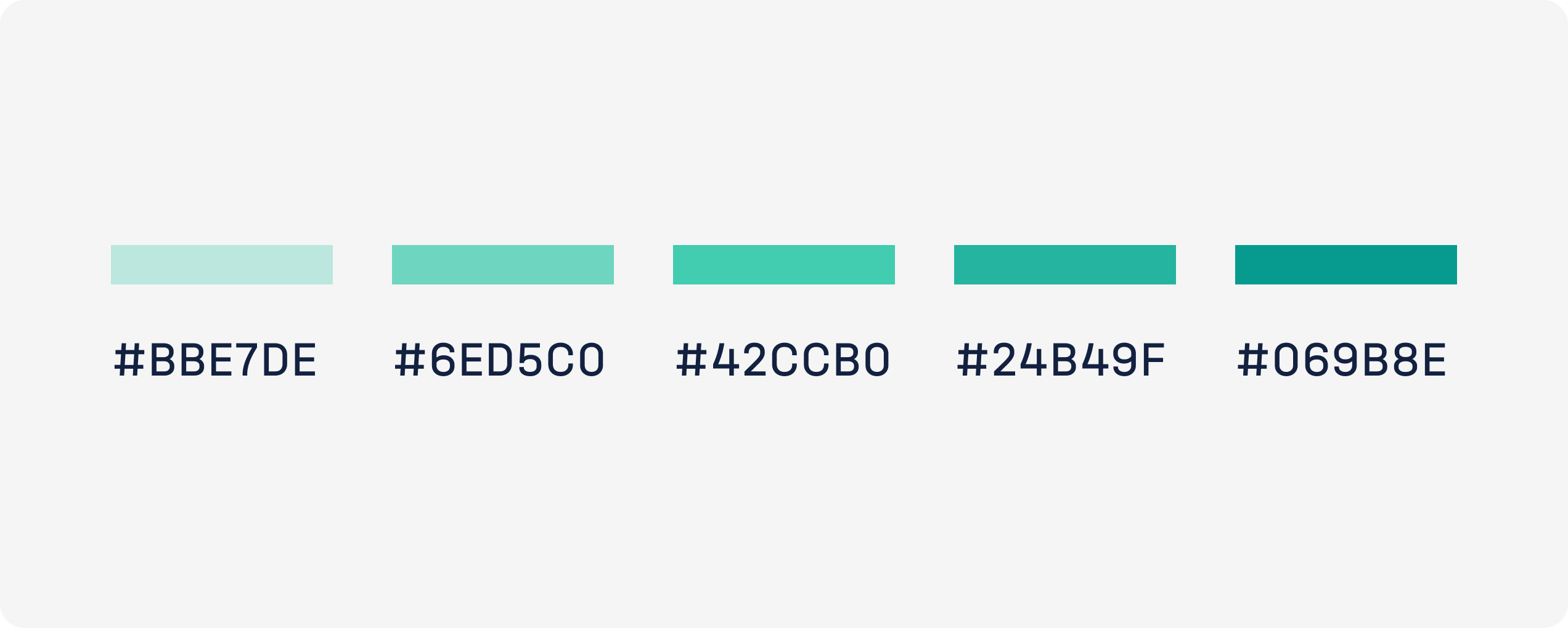
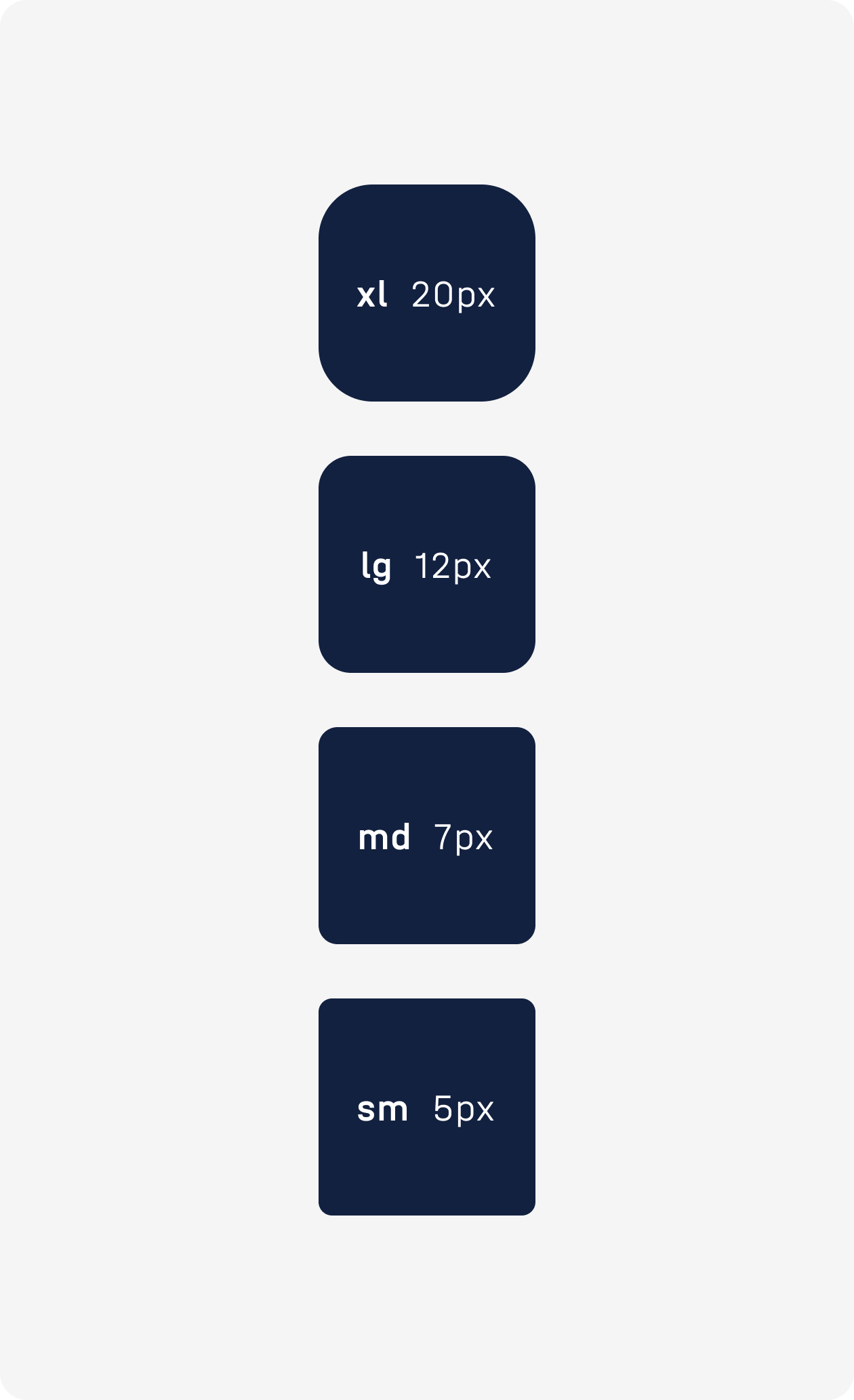
- Creation of design tokens to establish the core values that underpin our design system's visual style.
- Extension of the existing brand colour palette to include a set of shades and tints for each colour. As well as reworking some of the current colours in use to align better with industry standards and accessibility guidelines.
- Define guidelines for icon creation and handoff to reduce existing visual inconsistencies between icons.
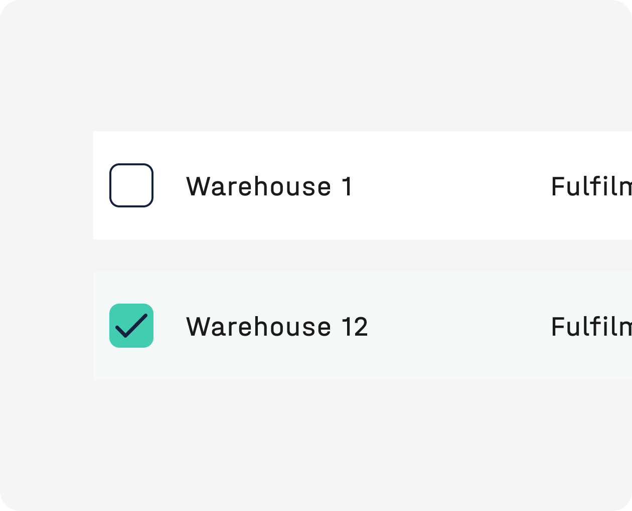
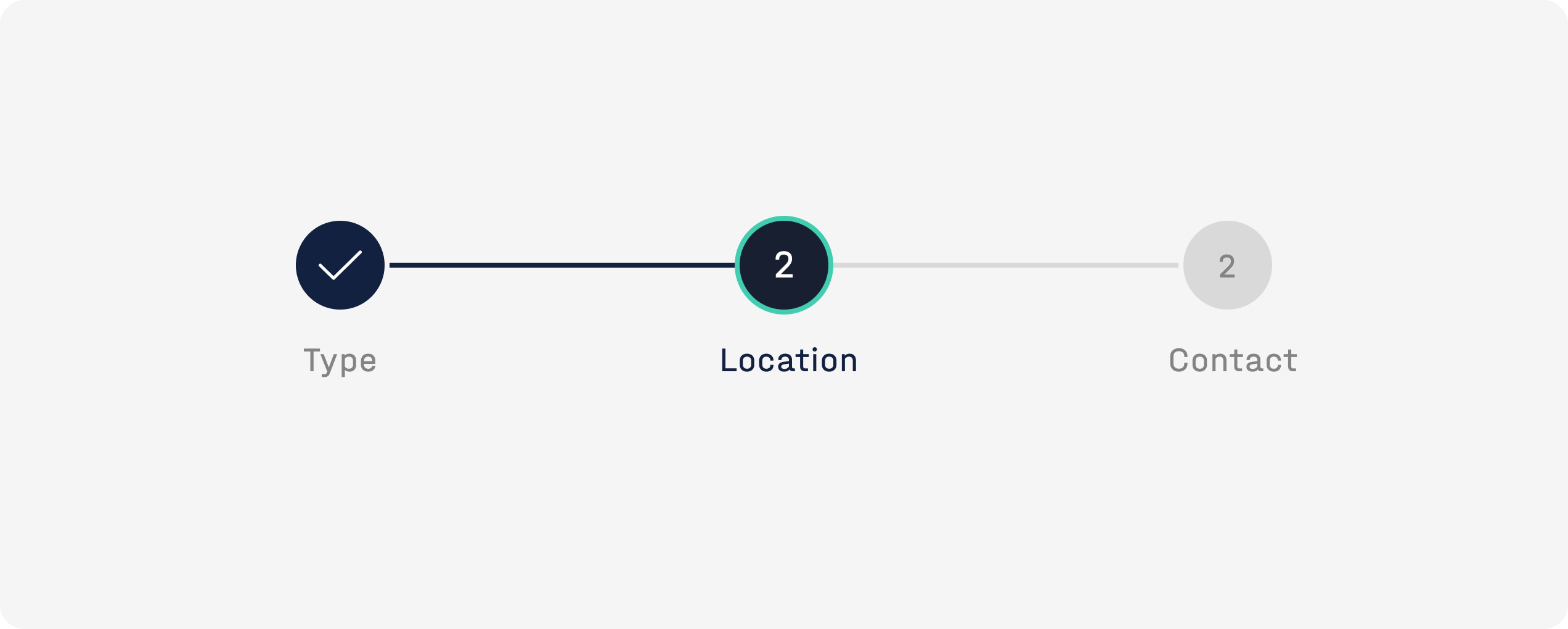
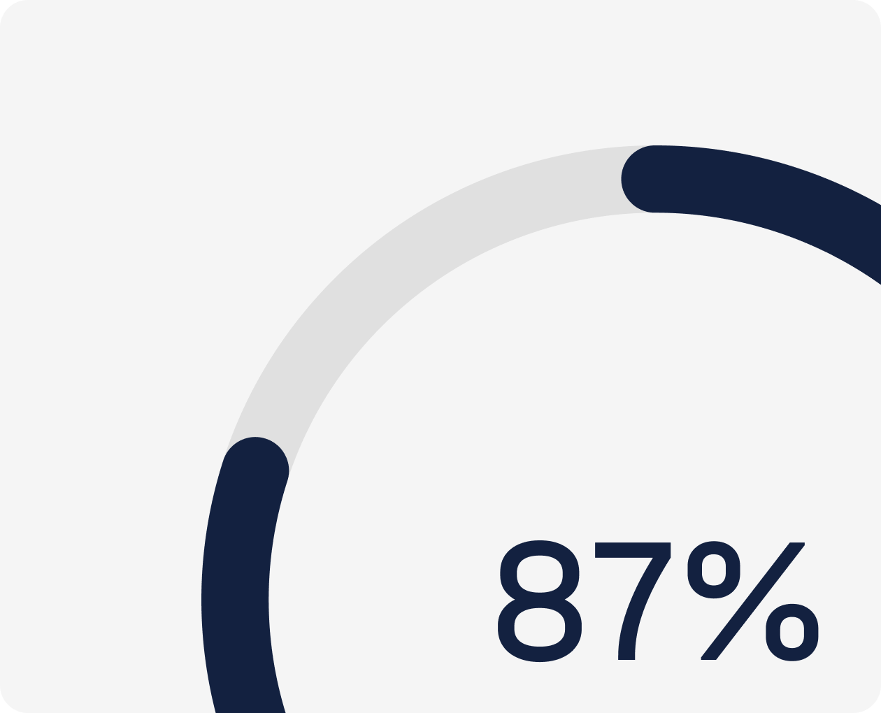
- Define the appearance, behaviour, and structure of components, considering user needs and product requirements.
- Create thorough documentation detailing the component's anatomy, layout, states and expected behaviour.
- Conduct thorough testing of components ease of use and configuration in Figma for internal users of the components.
- Create interactive prototypes to showcase animations and states.
- Collaborate with the design and product team throughout the design process to explain design decisions, exchange ideas and gain feedback.
- Closely collaborate with frontend engineers to ensure smooth implementation and adherence to the design specs and standards.

Background
There is no project dedicated to improving our design system, instead, I use each project as an opportunity to introduce any missing components or patterns into the library or to make improvements to existing components. With design systems, small incremental investments over time lead to big gains overall. To have a successful design system, you need to make a continuous effort to invest resources into it. Our team is small and scrappy. We try to do what we can with limited resources, often while juggling other responsibilities.
My end goal is to evolve the current system to establish a set of resources and standards that ensure consistency across the 7b platform.
Research
When reworking an existing component I perform a platform audit to gather use cases for this component - current and potential. This process also highlights where components are being misused. When the need for a new component arises I perform an audit to check for other components performing a similar function, to ensure a new component is needed. After the initial audit, when I have built up a clear overview of component usage across the platform (if applicable) and a list of requirements and ideas, I move on to the next stage of research involving industry analysis, best practises and an accessibility review. I often look at other design systems to see how they have solved the same problems. Other systems often provide helpful ideas for naming as well.
Process
During the next phase, I experiment and stress test various options across different use cases, often starting with pen and paper before moving to higher fidelity designs. It's at this point I expand designs to include all the necessary states. The next step of the process is to get design feedback from the team, followed by any further exploration or refinement. After this, I start the testing process, create an interactive prototype when necessary and create design documentation detailing all component variants, states, how and when to use, details of the behaviour, any animation specs and accessibility considerations. I have a kick-off with developers, work closely with the frontend developer during the build and then QA the component in Storybook post-build.
Testing
We are a small team and so testing components falls to me. The questions I try to validate when testing are:
- Ease of configuration - how easy is it to configure component properties? Does each configuration of the component produce the expected visual outcome?
- Correct configuration - does each configuration of the component produce the expected visual outcome?
- Ease of content - how easy is it to amend the content?
- Ease of manipulation - how easy is it to customise properties, subcomponents, styles?
- Responsiveness - do the elements flow correctly when the component is resized?
Highlights
Documentation
The addition of component documentation. Documentation is critical. Design system documentation is essential for building and maintaining a successful system. The original system lacked any documentation, so it made it hard for the developers to build the components and also led to divergence between the components in Storybook and Figma. By developing detailed documentation and guidelines for the platform's visual and interactive components, we create a shared language to help designers, developers and other stakeholders communicate effectively and minimise divergence. It also minimises time spent in QA and assumptions or miscommunications between the design and development phases.
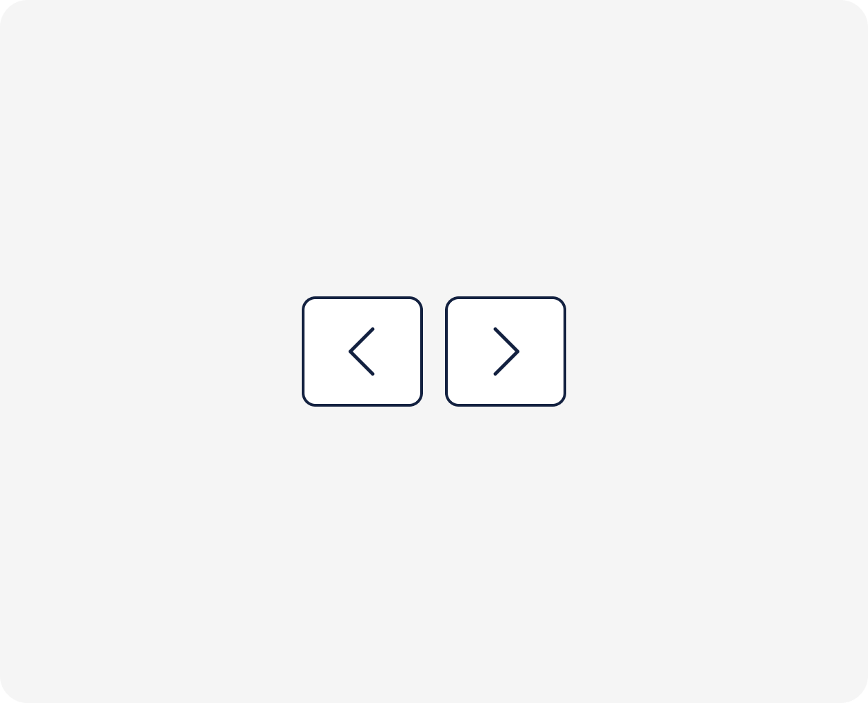
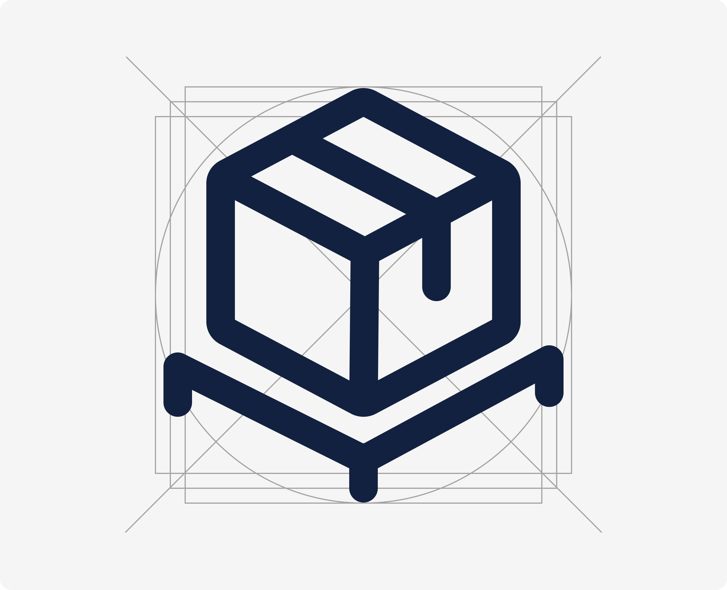
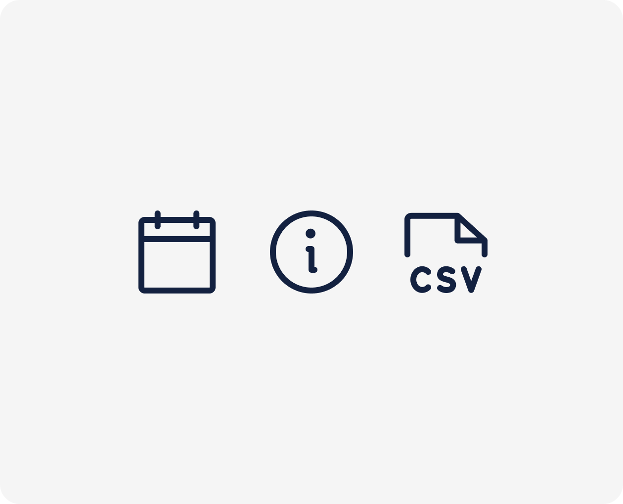
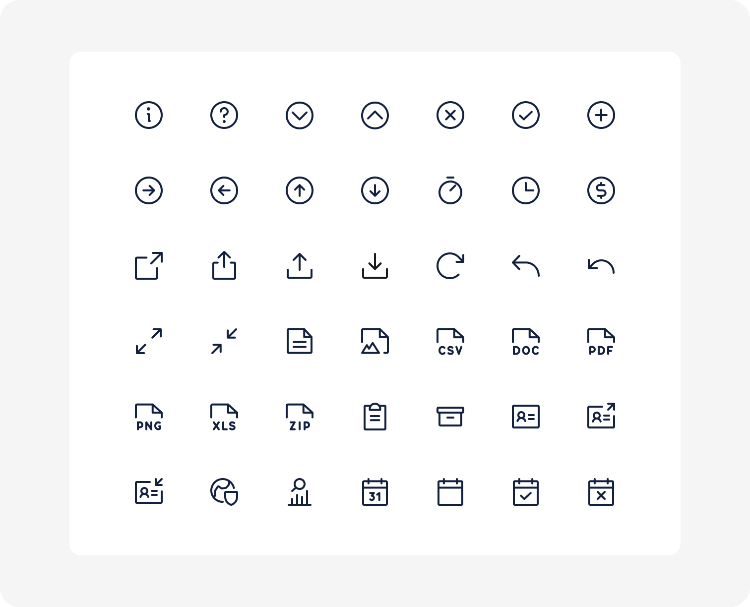
Icon standardisation
This was one of my first initiatives for the design system. My objective with this initiative was to reduce the current design debt and remove an obvious source of visual inconsistency across the platform by:
- Establishing set of guidelines for creating icons in the library and exporting them for hand off.
- Reworking the existing icon set following the newly established guidelines.
- Working closely with frontend engineers to replace existing icons with the new set and remove old legacy Font Awesome icons.

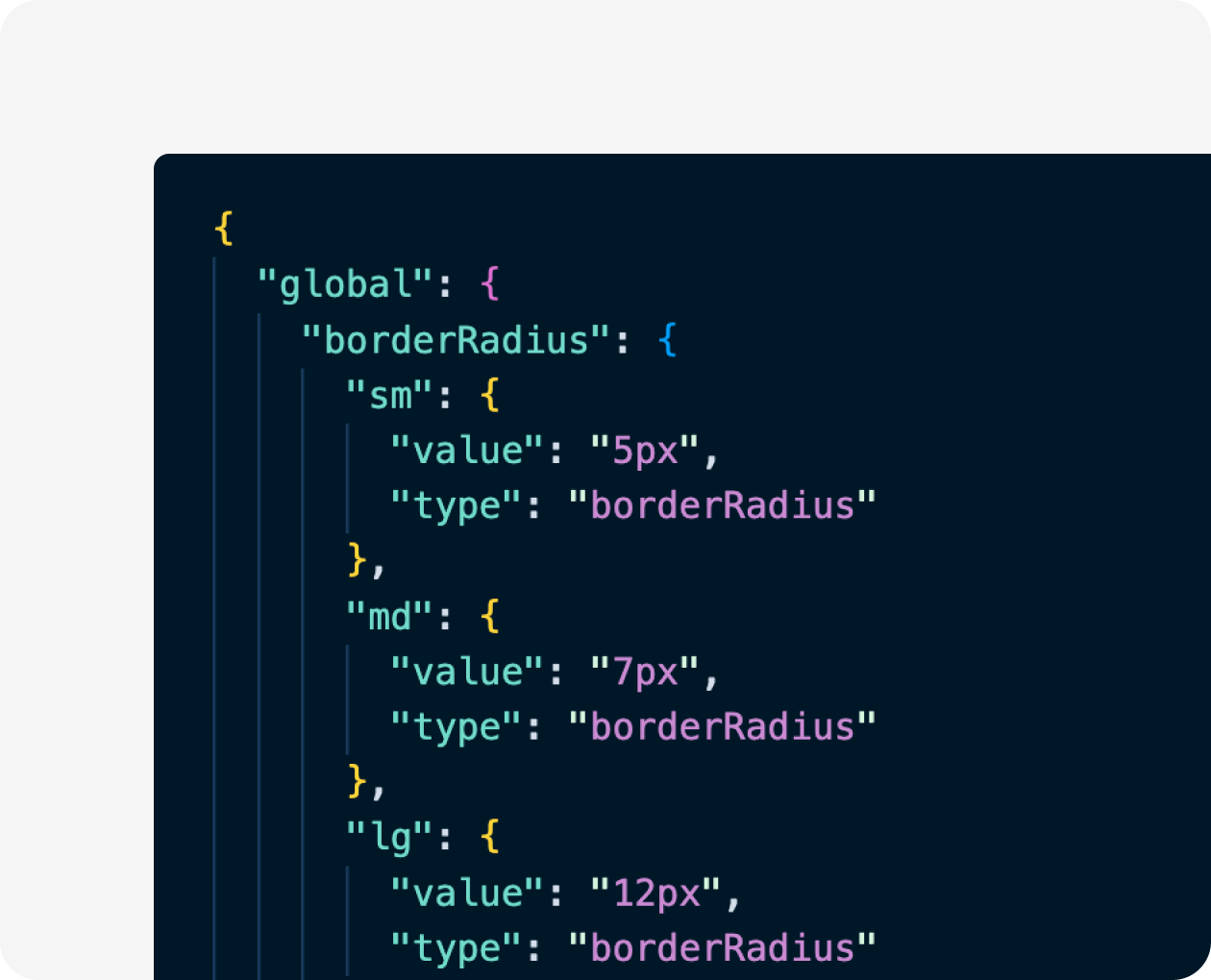
Design tokens
Implementation of design tokens in Figma and our codebase as our single source of truth for the core values that underpin our design system. This approach enables us to express design decisions in a platform-agnostic way and has also helped to establish a common language between design and tech for these core values.
Challenges, failures & learnings
- Under communication and education on the ever-evolving nature of a design system. A design system is organic - components go through phases of development, improvement and iteration based on new requirements, testing and other factors. Communicating this to the frontend team has, at times, been a challenge. I am not sure if this is a challenge I have solved adequately yet.
- Creating or standardising components as part of another project has its benefits and drawbacks. This approach allows us to easily test components in context and integrate them into the platform quickly. Striking a balance between pushing the design system forward (long-term value) and more immediate value through new features involves the need for compromises and knowing which battles to pick. Learning when is it OK to make a tradeoff and when to double down on something that is critical to the experience. Limited time due to tight project timelines, reduced the amount of time I could dedicate to the research part of the process.
- Naming is hard. However, it is a crucial foundation of a scalable, flexible design system. For components it was simpler - I used ARIA patterns, ideas from other design systems or used the name already used internally to refer to existing component. However for design tokens it was harder and in hindsight, I should have spent more time at the beginning thinking about our needs and our approach to naming design tokens. I went for a very flat structure, with primitives and then most components referenced these primitives, with a few semantic variables sprinkled about. On reflection and with more experience (and subsequent research) I think the approach outlined by Nathan Curtis in his article on naming tokens in design systems seems like a sensible approach - having a basic semantic theme palette and then components with palettes containing token aliases specific to that component. Resulting in more tokens but ultimately reducing complexity in decision-making.
The Impact
I have evolved the design system to create a better toolkit of pre-made design solutions, patterns, design tokens and components, tailored to our platform and brand, which has helped to improve the speed of UI design and development. It has also helped to create a more unified user experience with familiar patterns and behaviour and more visual consistency. Users of the 7b platform can be more confident of what will happen when they interact with each component, enforcing the idea that they can rely on our product. In short, improved consistency helps build trust in our users.
Conclusion
As with any design system, ours is a work in progress. It is an organic entity, that evolves with the brand, the codebase and new features built for the platform.